|
Starting April 21, 2015, Google results on mobile searches have been affected worldwide because of Google Search expanding its use of mobile-friendliness as a ranking signal. With this new update, users will find it easier to get relevant, high quality search results optimized for their devices.
Desktop traffic will not be affected by Google expanding its use of mobile-friendliness as a ranking signal. This change will affect only mobile searches.
Based on these new implementations, requests for websites optimized for mobile devices have gained popularity. But what is the difference between a mobile-friendly website and a responsive website? Here is a brief explanation to help you understand both terms.
Mobile-friendly Website
A mobile-friendly website is when a site is capable to display its content on mobile devices such as smartphones, iPhones, iPads, and tablets. Websites created with mobile-friendly capabilities are designed to display their content the exact same way across devices.
Developer may choose to build a mobile-friendly website with its own unique URL, different from main site. This will allow the developer to have flexibility on the way the mobile-friendly website is programmed in order to offer users a better experience.
This separate mobile-friendly website results on an increase of the total amount of work required to maintain and update your site, and may result in possible technical issues.
Responsive Website
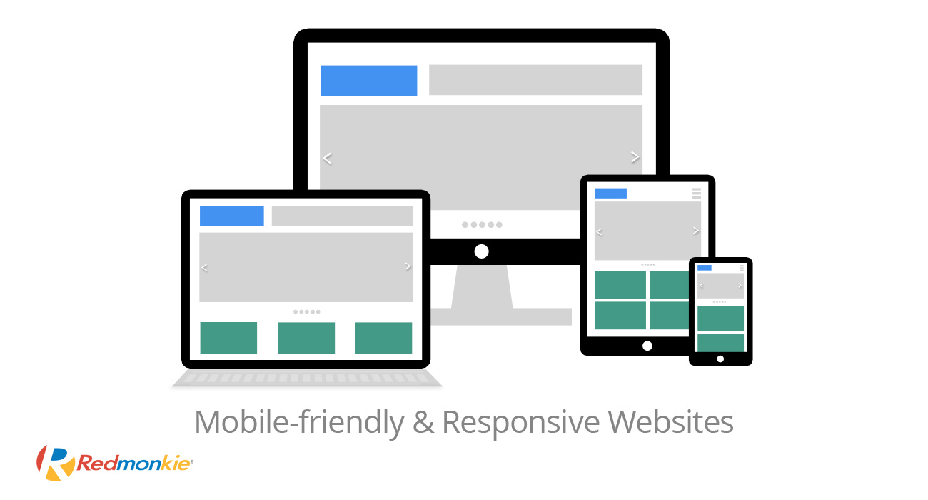
A responsive web design is a site that uses the same URL, and whether the website is displayed at a desktop or at a mobile device, the content will “respond” according to the screen size of the device it’s being accessed by.
Because of its dynamic content, responsive websites offer optimal viewing experience for users.
Responsive web design is by far the best option for your website or ecommerce.
Contact our Help Desk to receive your personalize and free site analysis, which will contain comprehensive information about your site’s performance, mobile functionality, search engine optimization, speed, and security.
If you do not currently have a website and you want to create one for your business, our experienced web developers will be sure to offer you a new website, or e-commerce, with the latest technology and responsive capabilities to enable you to reach your full potential on the Internet.
|


